GBN Website
Client
GB News
Role
8 months
Role
UX / UI Design
Responsabilities
- Competitor analysis
- Design system
- Documentation of design
- UX / UI Design
Creating a scalable Living Stream & editorial website
How can we integrate a website with three strong verticals, Live, News, and community?
Our end users are people who like to read and watch and also interact with presenters, on the other hand, we have our internal users, editors, who feed that website 24 hours a day and need a smooth and reliable CMS to execute quickly and well. As we can see, many questions arose when we first started.
Challenges
- Create a solid foundation
- Increase live views
- Increase page views
- Follow very limited branding guidelines
- 100% good page experience scores across the site
High Level Goals
To build a fully responsive and SEO-compliant website that focuses on promoting a community feel, with rich-media content coverage and flawless user experiences across any device or platform – tailoring into a subscription/premium model to offer unique and exclusive content, events, and more.
To build a fully scalable, secure, feature-rich, and smooth CMS that allows quick, collaborative, and accurate creation and distribution of all rich-media content to many partners.
Be data-driven – Utilise data to steer change
Create a solid foundation
Grow our digital traffic
Increase our digital revenue
Be able to access the live stream from anywhere
Built a community
Impact
19°
position in the UK media websites, previously in 144°
from Feb 2023 – Sep 2023
2.5M
users per day, increased from 150k
from Feb 2023 – Aug 2023
35M
users per month increased from 4.5M
from Feb 2023 – Aug 2023
Source: Press Gazette custom list (includes Apple News Distributed Content) using data from © Ipsos, Ipsos iris, 1-31 July, Adults 15+. Ipsos iris is endorsed by UKOM – and Google Analytics
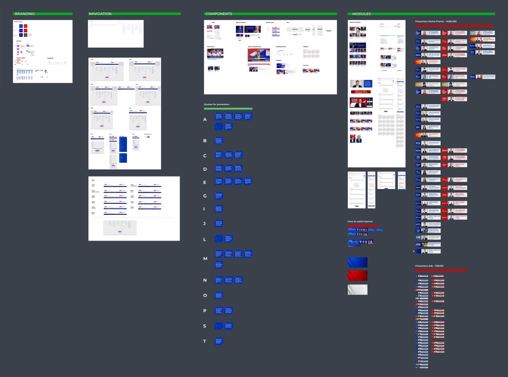
Heuristic Analysis
After an analysis of the current website, we discovered some inconsistencies and problems: Ads in the wrong position, a search was not clear to the user, different font sizes and families, the live stream is too low on the page, and no organization or prioritization on what is important on the home page.
First Steps
Working closely with the editorial team, the first step was to map, define, and group Sections, tags, and content types.
Reducing from 5000+ tags grouped in 2 sections to 180 tags grouped under 7 sections, we were able to create a high-level site map.
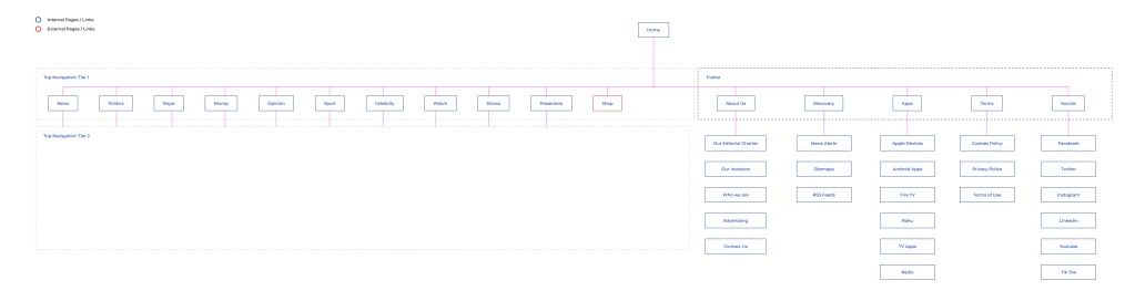
Competitive Analysis
With the site map defined we started looking at what our competitors were doing, and, besides Fox Channel which has a call to action to Live Streaming, the others normally use 10 to 16 elements on the Nav, plus login and search. Some of them use multiple colours for each section and have their own way of grouping topics.
Prioritize
Always working closely with different roles within our squad, we prioritized and structured together what were the phases of discovery:
1st phase
- Navigation
- Layout
- Previews
- Homepage
- Article page
- Live Player Module
2nd phase
- Shows
- Presenters
- Author
- Schedule
- Listen
3rd phase
- Static Pages
- CMS Editor
Discovery
For several of these stages, intensive research was necessary to define the real need for each type of challenge we face daily. One of the formats that was very useful when blocks appeared was to come back to basics:
1.What the asset should / shouldn’t do
2. Ideas
3. Concerns
After this exercise and the documentation that was produced, the stakeholders had a full view of the possibilities we were proposing, helping them to make better decisions based on business goals.
Wireframe
Based on multiple discovery sections it was time to bring all elements together into a wireframe. After some attempts, we decided to have 3 main ad slots (40% with + top), and 60% for content on the home and articles.
The content is divided into a bigger space for News and modules, and a Live stream sticky module with some more ad slots below it. On main the content, the stakeholders are dedicated to having the 20 top stories manually curated to bring more viewers for each story.
Following that, all sections are displayed in the same order as the top navigation.
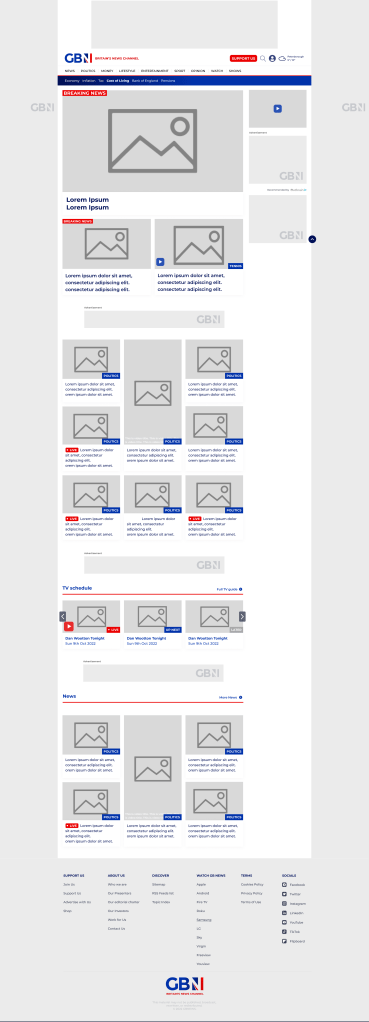
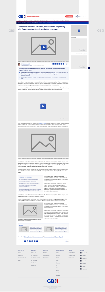
For all other pages, the ad slots stayed at the same position, but there’s a single column to the content.
Design System
As mentioned before, the challenge of building the Design System was the lack of colours. So, the Primary blue was used for all labels, only changing the text. The secondary blue was used only for the “Opinion” label. Finally, the red was only used for calls to action, and to complement when necessary.
The result was, a scalable design system to be used in the future app and also as a source of graphics that will be used on live TV.
Output
The output was a fluid, structural, and easy-to-use website that will allow our users to navigate through the site with ease and discover rich-media-focused coverage of news.
Focusing on watching our live stream, consuming the latest and breaking news content, joining and contributing to the community, and being able to discover “who we are”
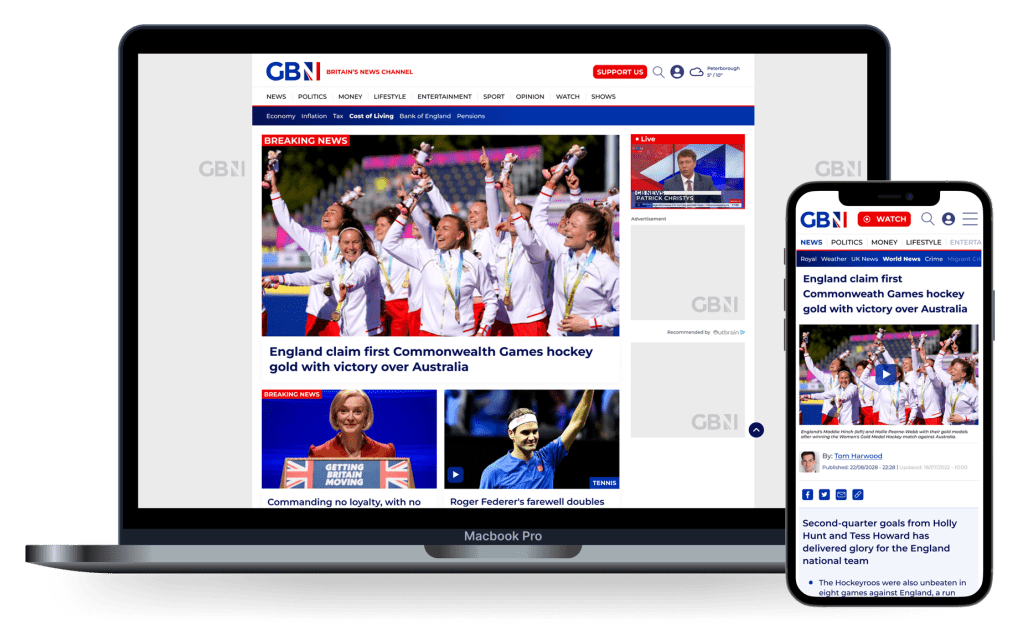
To see the full website, access: www.gbnews.com
Lessons Learned
It’s hard to achieve excellence in all areas on a first release of a project as big as this one, involving multiple third parties and stakeholders. The MVP and multiple releases that we are still doing, helped me to understand that there’s no “final” product and how important is to keep scalable assets so we can keep improving the website.
